
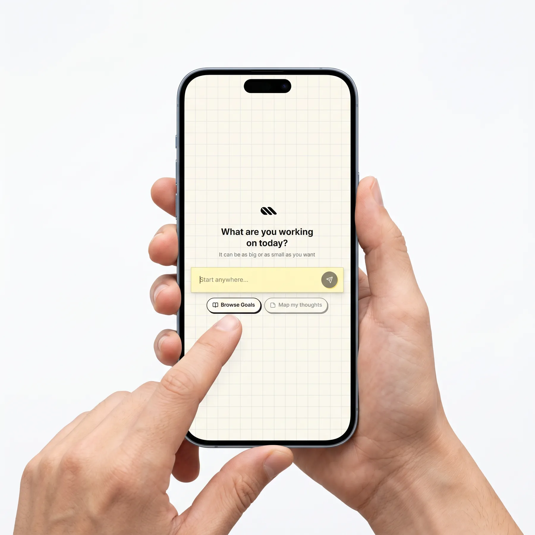
Emphiciency is an app that takes a big goal, finish a thesis, learn a language, train for something, and turns it into small daily steps. When you miss a day, it quietly re-plans instead of piling missed tasks on top of you.
I did the whole thing myself, designed in Figma, built in Claude Code. Along the way: user interviews, the flow, the AI prompts, and real users to see what broke. The sections below walk through each part in the order I did it.
It started with my roommate.
My roommate has severe ADHD. I watched him try every productivity tool I’d ever heard of, adopt it, love it for a week, then watch it turn into another thing he was failing at. Emphiciency started with a question I couldn’t answer: why does every tool designed to help him end up making things worse?
Before I designed anything, I went deep on executive dysfunction itself, the cognitive mechanics, not the productivity-blog version. The audience isn’t a niche. Students, early-career workers, and people with ADHD adopt these apps to cope, then watch them become another thing they fail at.
The framing the research produced: productivity tools aren’t broken, they’re built for a user whose life never has bad weeks. Most people have bad weeks. That mismatch set the whole project: build a tool that assumes inconsistency is the baseline.

Research
I interviewed a variety of people with executive-functioning challenges, and, deliberately, people who support them: teachers and therapists. The goal wasn’t a statistically clean cohort. It was to hear the same problem from different vantage points. A teacher describing what a student does differently the week after a bad Monday turned out to be more useful than another person describing their own bad Monday.
A few things came up in every conversation:
Synthesizing into a conversation partner.
Interview transcripts and supporter notes, cleaned and anonymized, went into a custom GPT on ChatGPT. Not as a persona to roleplay, but as a synthesis I could interrogate. I used it to pressure-test why current solutions fail: why streaks backfire, why “just one small step” isn’t small for someone with EF challenges, why planning tools become an avoidance surface.
The thesis that came out of that synthesis is what the product is built around: adaptive planning, a plan that bends with the user instead of breaking. Missed days get quietly absorbed. Plans fit into life, not the other way around. No streaks to reset, no ranked priorities to negotiate.
I also used the GPT as a sanity-check partner while designing, pressure-testing a flow against the synthesized pattern and asking it where a real user with EF challenges would fall off. Tap an attribute below to see the signal behind it.

The GPT didn’t replace judgment, it let me hold more data at once. I could ask it “would this user abandon this flow” and get a shaped-by-the-transcripts answer in seconds, then go back and fix the flow before anyone sat in front of it.
Journey map and the questions I held the design to.
Before drawing anything on a phone, I built a journey map and wrote a list of design questions to hold every screen against, parameters that kept the product cohesive as the surface area grew. A few of them:
Every screen that went into Figma had to answer these the same way. When two screens answered differently, the design was wrong, not the question.
Mapping the system before drawing a single screen.
With the journey map and parameters in hand, I mapped the whole loop end-to-end, intake, decomposition, daily view, reprompting, weekly check-in, archive. The flow’s job was to let me argue with the system before drawing a single screen. Cheaper to fix here than in Figma.
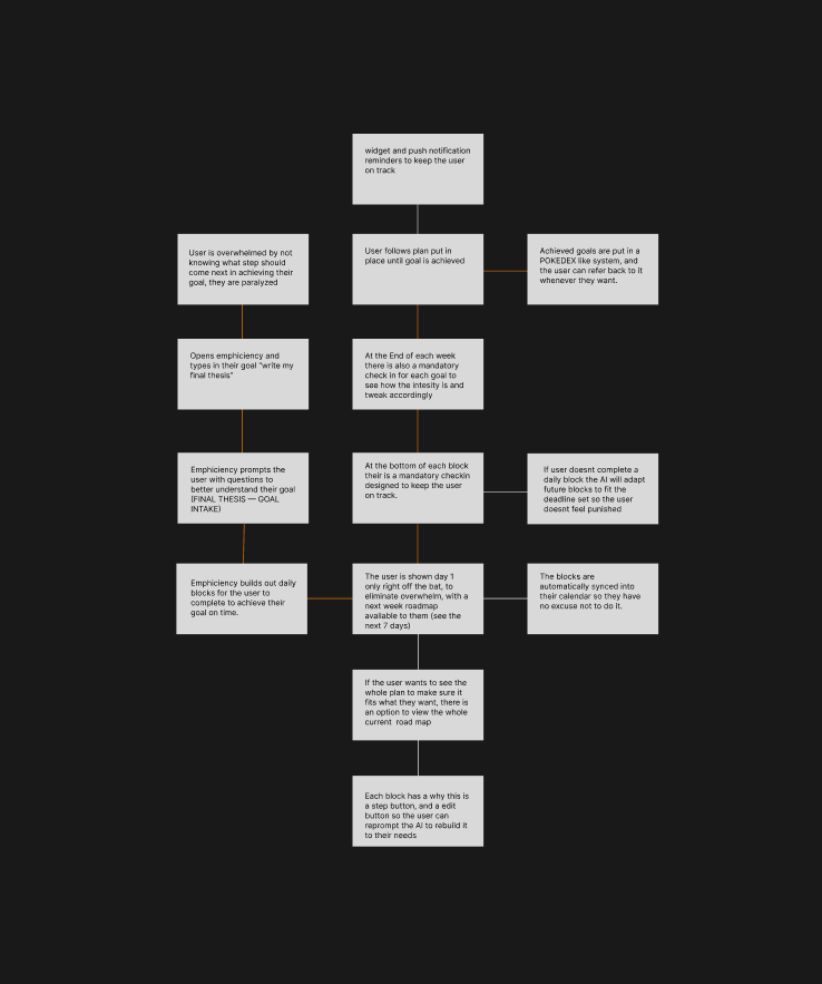
Two decisions locked in here. One: the user only ever sees today. The week is available on request, never by default, visible future load is the #1 trigger for abandonment. Two: missed blocks don’t carry over. The AI rewrites the downstream plan so you never open the app to yesterday’s failures.
From flow to low-fi screens.
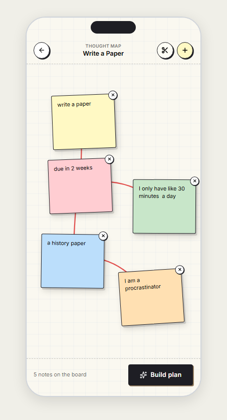
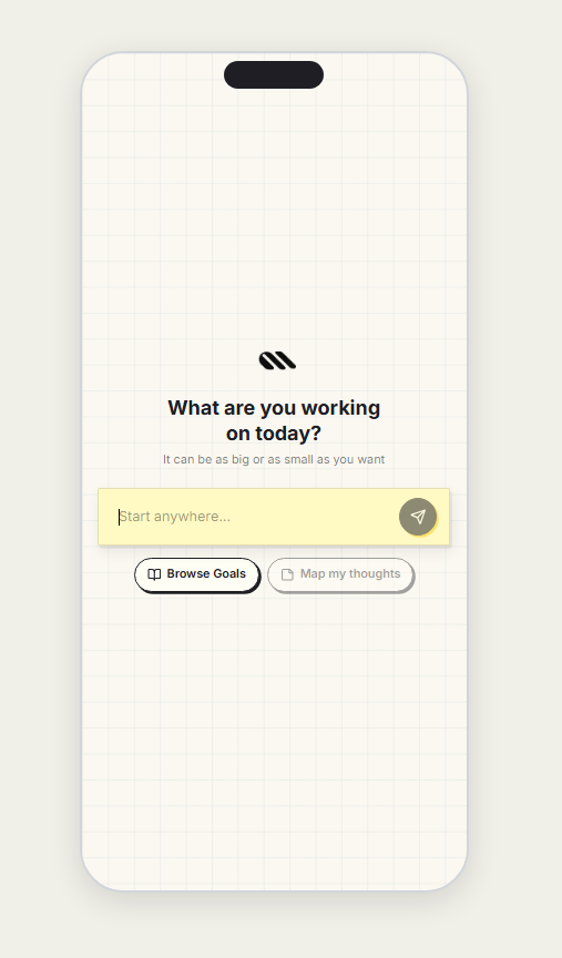
With the flow agreed on, every node became a wireframe. The goal wasn’t aesthetics, it was to check whether the interactions would actually fit on a phone. I drew deliberately ugly so feedback stayed on structure, not type.
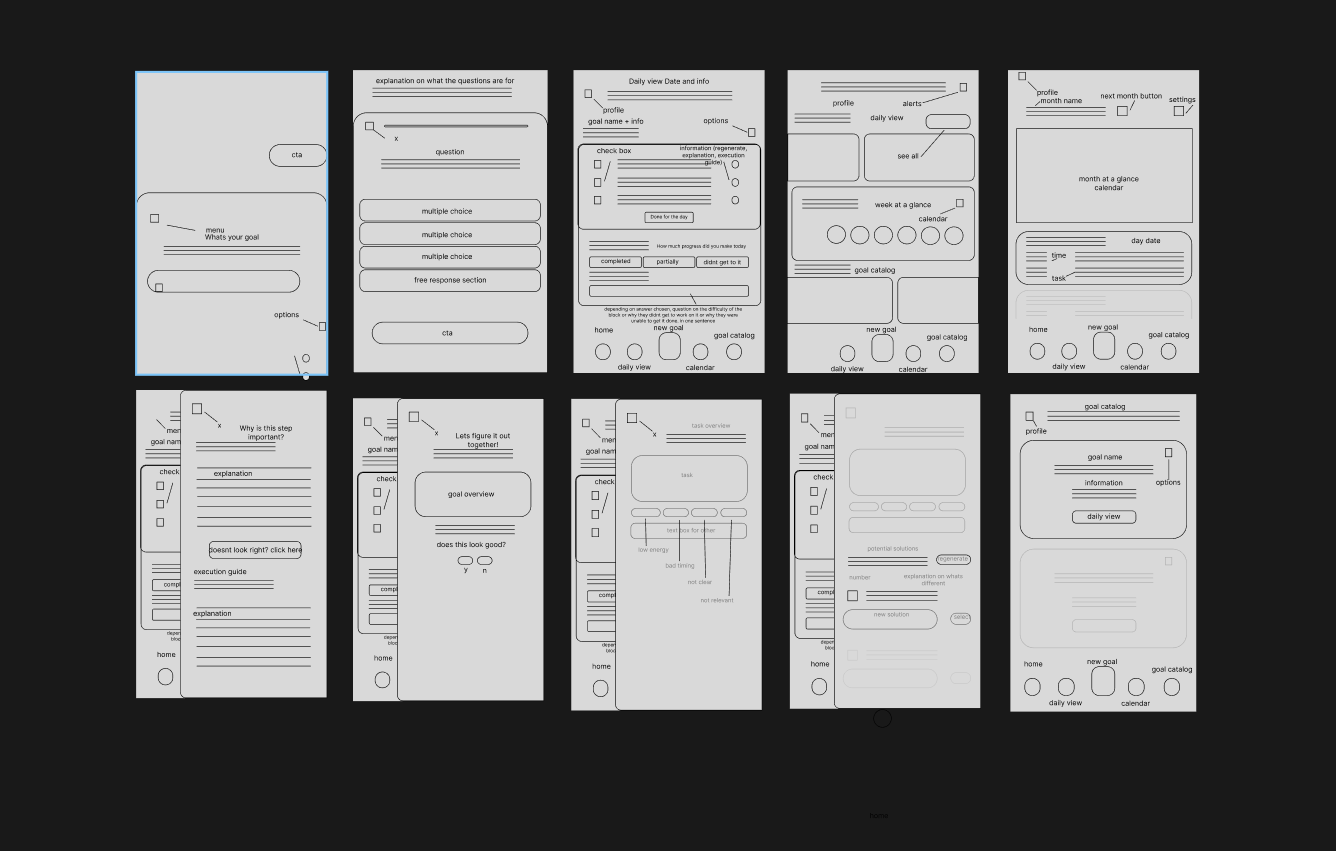
Three things changed between the flow and the wireframes. Intake grew a free-response field, multiple choice alone couldn’t catch every goal shape. The Today View got a “why is this step important” prompt to lower friction without adding a screen. And regenerate split in two: suggestions on the left, your own reprompt on the right. Each correction cost an eraser, not a Figma re-flow.
From what I heard to rules I design by.
I grouped the research into five rules the product actually holds, not principles on a slide. Every interaction gets tested against them. Break a rule, don’t ship.
Goals → Blocks → Schedule.
A big goal gets broken into small verb-first Blocks, and the Blocks get dropped onto your week. Tap a goal below to watch it happen.
Every Block is phrased as a verb-first action, sized to fit one session, and re-shuffled whenever your inputs change.
Today View, reprompting, and the cost of friction.
Each day you see a Today View, only the Blocks for today, nothing else. Tap reprompt if a task feels too big, unclear, or just wrong for your state: simplify, postpone, or get help starting. The plan shifts live, and the rest of the week shifts with it.
From wireframes to a real, working app.
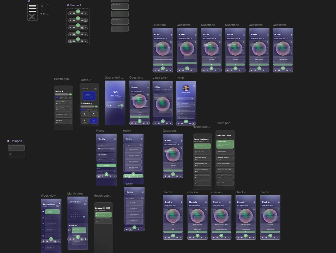
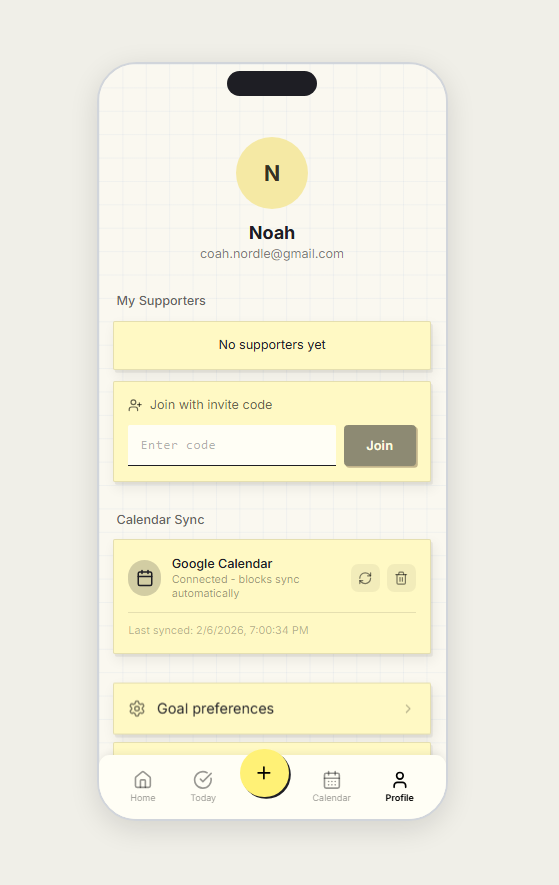
With the wireframes and journey map settled, I moved the whole thing into Claude Code and built it as a real app, not a clickable prototype. Two integrations made it behave like a product instead of a demo: the Google Calendar API, so plans read the user’s actual schedule, and the Anthropic API, powering the planning logic, breaking goals down, fitting blocks around real commitments, re-planning after a miss.
How the AI actually works.
Four small jobs, one at a time. Tap a stage to see what the AI actually does and says.
The tone mattered as much as the output. The AI never lectures, never mentions streaks, and never tells you to “try harder.” It’s there to help you start, not to judge you.
A quiet model, not a scoreboard.
A daily check-in quietly captures energy, stress, sleep, and blockers. You never see a score, the data feeds a local model that notices your peak hours, how you recover from misses, and what Block size you actually finish.
The model is cautious on purpose. It waits for ten data points before shifting defaults, and every change says why, in plain English. No silent nudges.
What the app actually does.
Four moments that make the app feel different from the productivity apps I grew up abandoning.
What the process taught me.
The biggest shift was realizing AI isn’t a replacement for design thinking, it’s a tool that makes me faster at it. Synthesizing a stack of transcripts into something I could interrogate would’ve taken a week; with a custom GPT as a thinking partner it took a day, and I still made every call. Prototyping in Claude Code let me test real flows with users instead of clickable mocks. The craft didn’t go away, it got amplified.
Second lesson: research never stops. Conversations shape a product. Watching people use it changes it. Every section of this case study is a belief I held before testing and a correction I made after.
Third: the hardest part wasn’t the AI. It was resisting the urge to let the AI solve problems a sorted list could handle. Treating AI as one material among many, not the material, made the product quieter and more honest.