
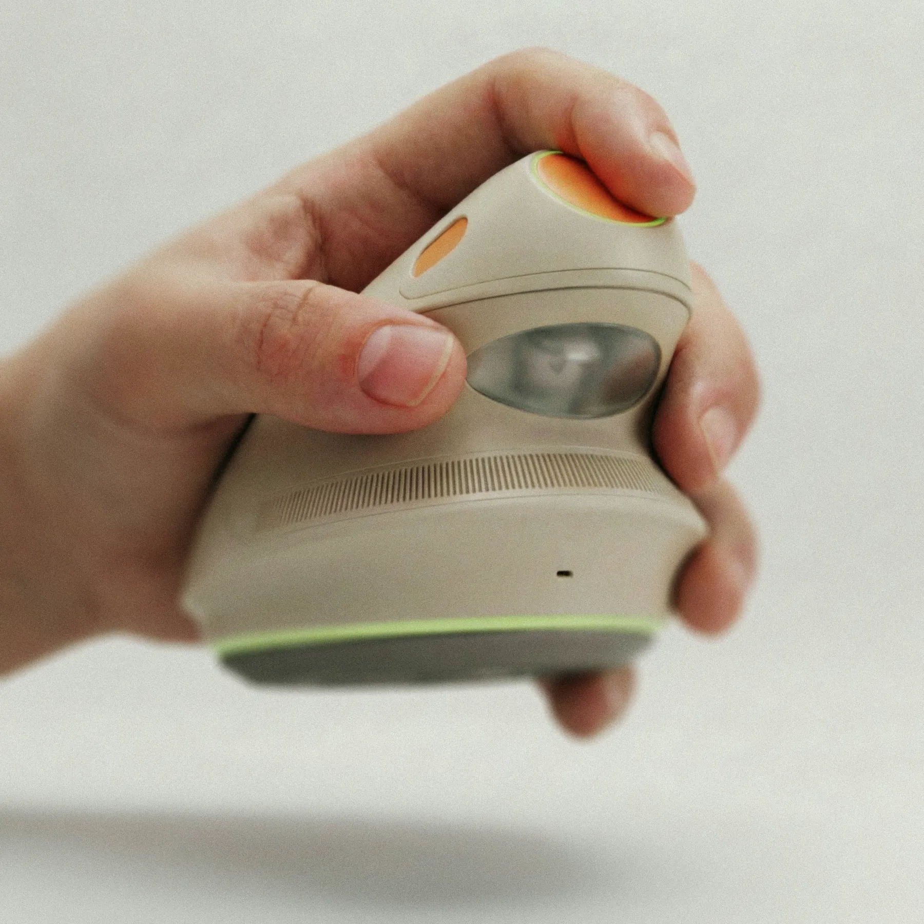
Gentra is a concept for an at home auto injector designed for people who self inject regularly. It uses a compact ultrasound system to identify the optimal injection site, while a vibrating ring provides sensory distraction just before delivery so the injection is barely felt. The design is driven by two priorities: making the experience more intuitive than current injector pens, and reimagining the product so it feels approachable rather than clinical, expressed through its form, materials, and loading mechanism.
The buildup.
People who self inject at home often spend more time worrying about the dose than actually delivering it, and interviews consistently show that the anticipation leading up to the injection is more uncomfortable than the injection itself.
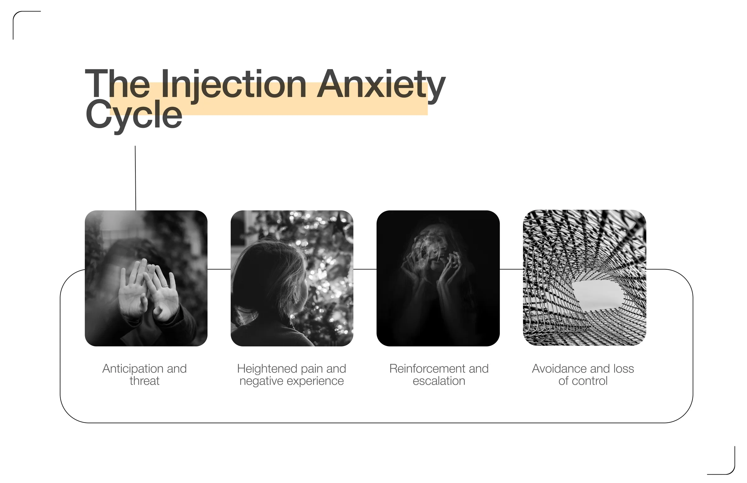
Stage three is where the cycle is worth attacking. Every reinforcing injection makes the next one harder to start, so breaking that link is what loosens the rest of the cycle.
Patterns.
I talked to people who self inject across biologics, fertility, and GLP-1s, then compared what they said with the research. The same three problems kept coming up.
These problems build on each other. Anxiety leads to uncertainty, uncertainty leads to hesitation, and hesitation leads to missed doses. The design needs to solve the whole chain, not just the last step.
Who it is for.
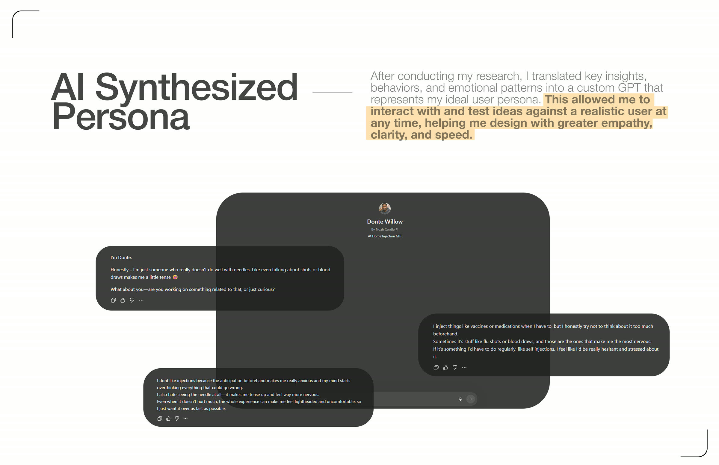
I loaded the interview transcripts into a custom GPT and tuned it against the persona I had built from them. I used it to pressure test questions about routine and pain points, so I could sanity check an idea in minutes instead of scheduling another session.
The problem.
Using current devices means holding steady, pressing down, and waiting a few seconds. It is a firm, physical action you feel the whole time. They work, but they still look and feel very medical, and each use can bring back some of that stress.
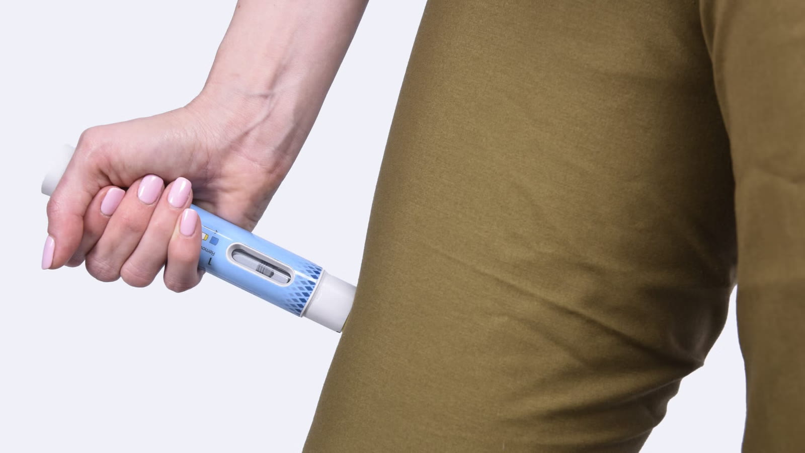
Spring loaded pens rely on force, and the user feels that through the hand and arm.
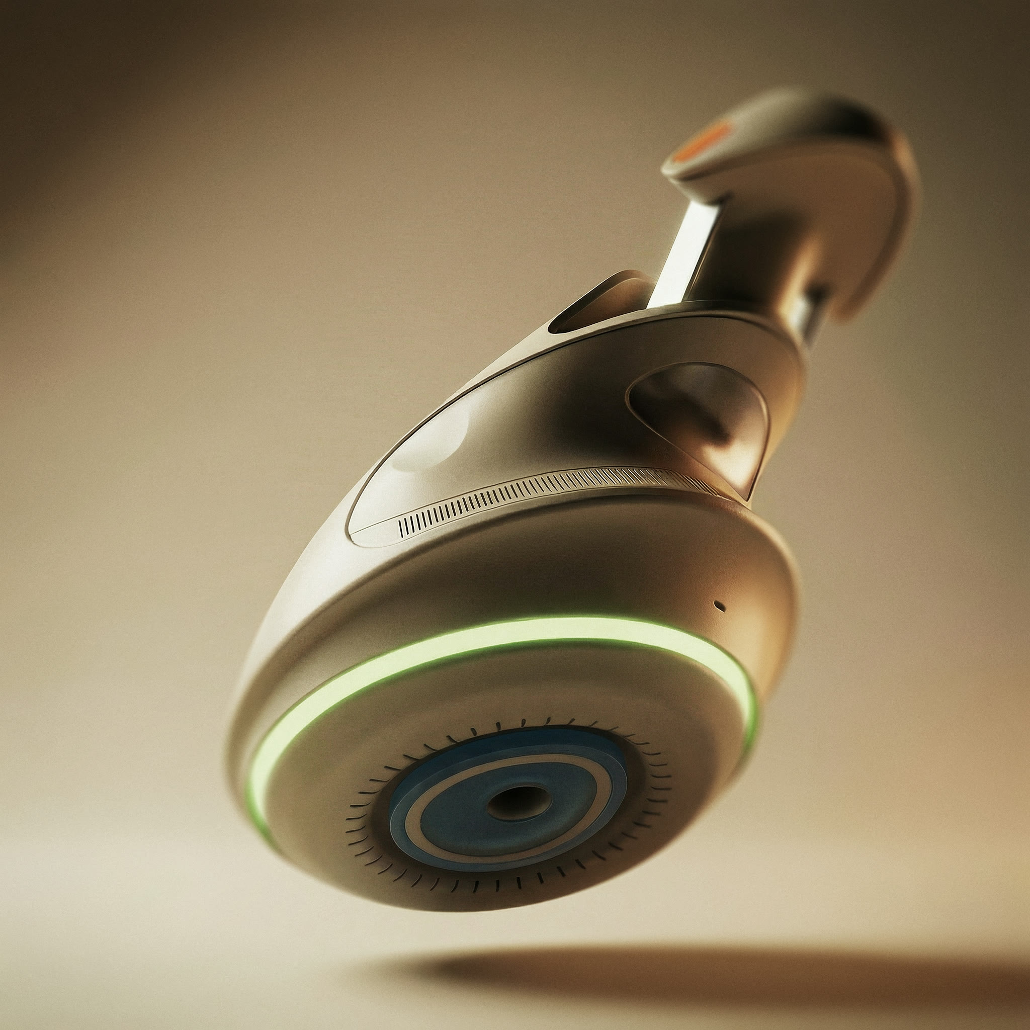
A low frequency ring gently vibrates the skin just before the injection, helping the sensation feel less sharp.
Design an at home injection device that reduces stress around the dose. Clear guidance, comfortable to hold, and simple automation where it helps.
Friendly.
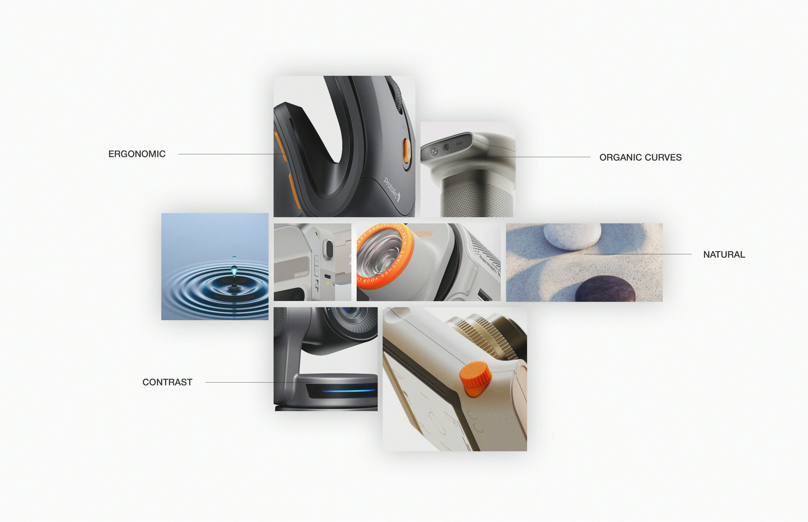
The form takes inspiration from smooth ceramics and everyday tools, the kind of objects that feel normal in a home. The goal was to move it away from the look and feel of typical medical plastic.
Ideation.
I started by pulling inspiration from soft, familiar household objects, especially computer mice. From there I explored a range of ergonomic shapes, focusing on reducing the tense, white knuckle grip that comes with traditional pen injectors. The goal was to create a form that feels natural in the hand and easy to understand without thinking.
Hands on.
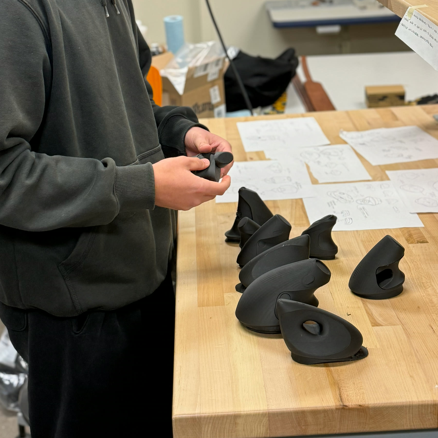
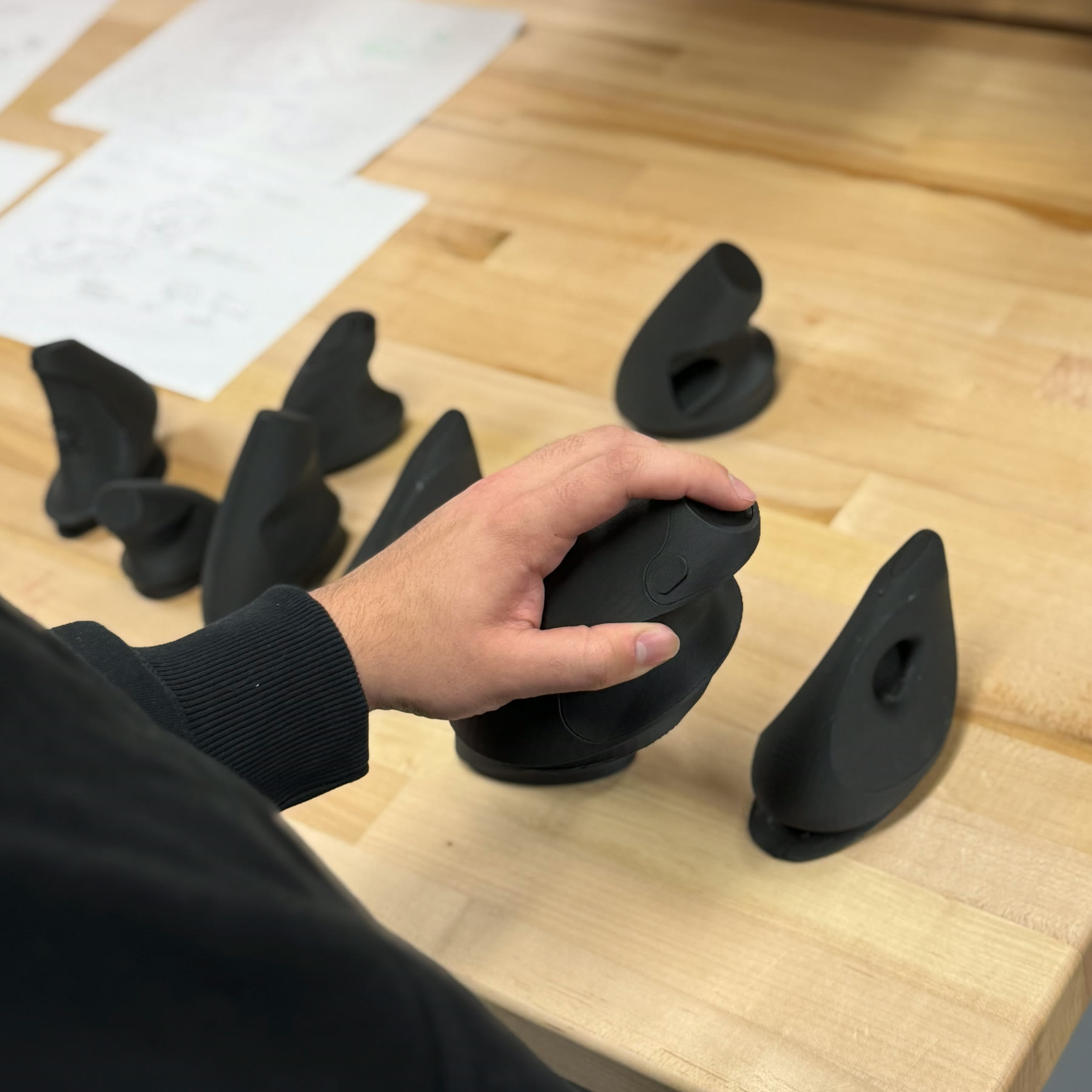
I 3D printed a range of forms and put each one into people’s hands. What I learned from each session went straight into the next version. Keeping the loop short meant every round moved the form somewhere.
Warm.
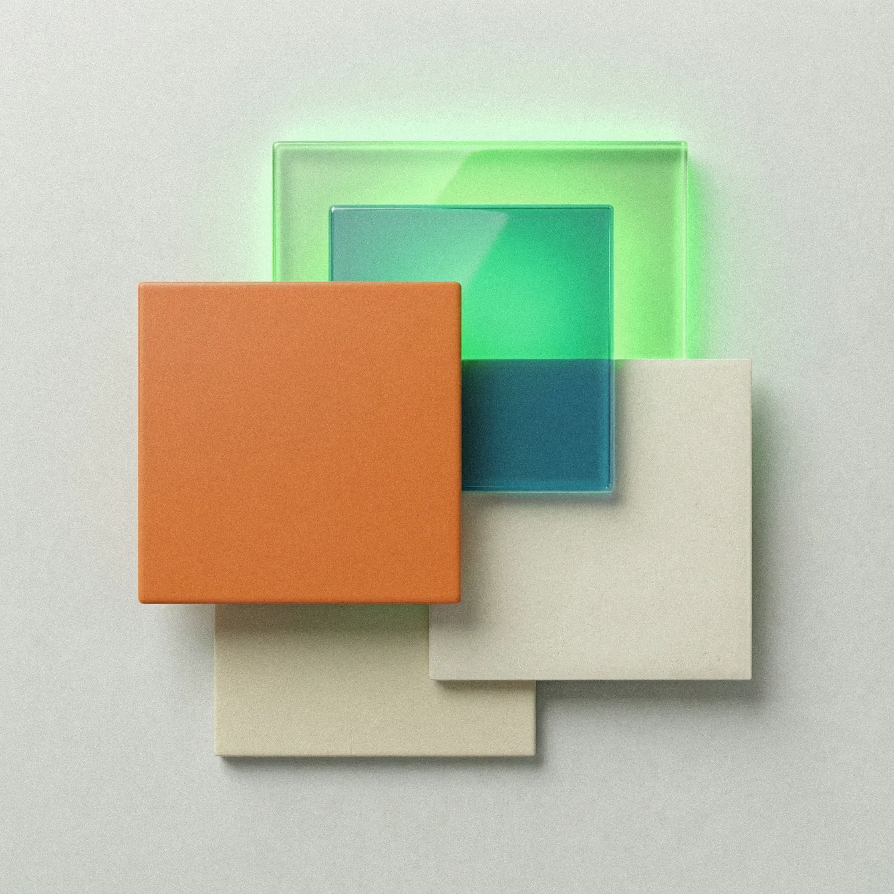
Most medical devices use bright whites and cool blues. Gentra shifts warmer. Bone and soft off white tones run through the shell, giving it a calmer feel instead of a clinical one. The button carries a warm accent, while the skin contact ring uses a cooler tone. Each material is chosen with a clear purpose.
A direction I didn’t take.
Earlier in ideation I explored a more rounded, blob like form with a straight pull cartridge system. It looked clean, but it didn’t match the goal and felt awkward in the hand. The shape wasn’t ergonomic, the surface felt slick, and the cartridge system added unnecessary complexity. I dropped it and moved forward with the wedge.
In hand.
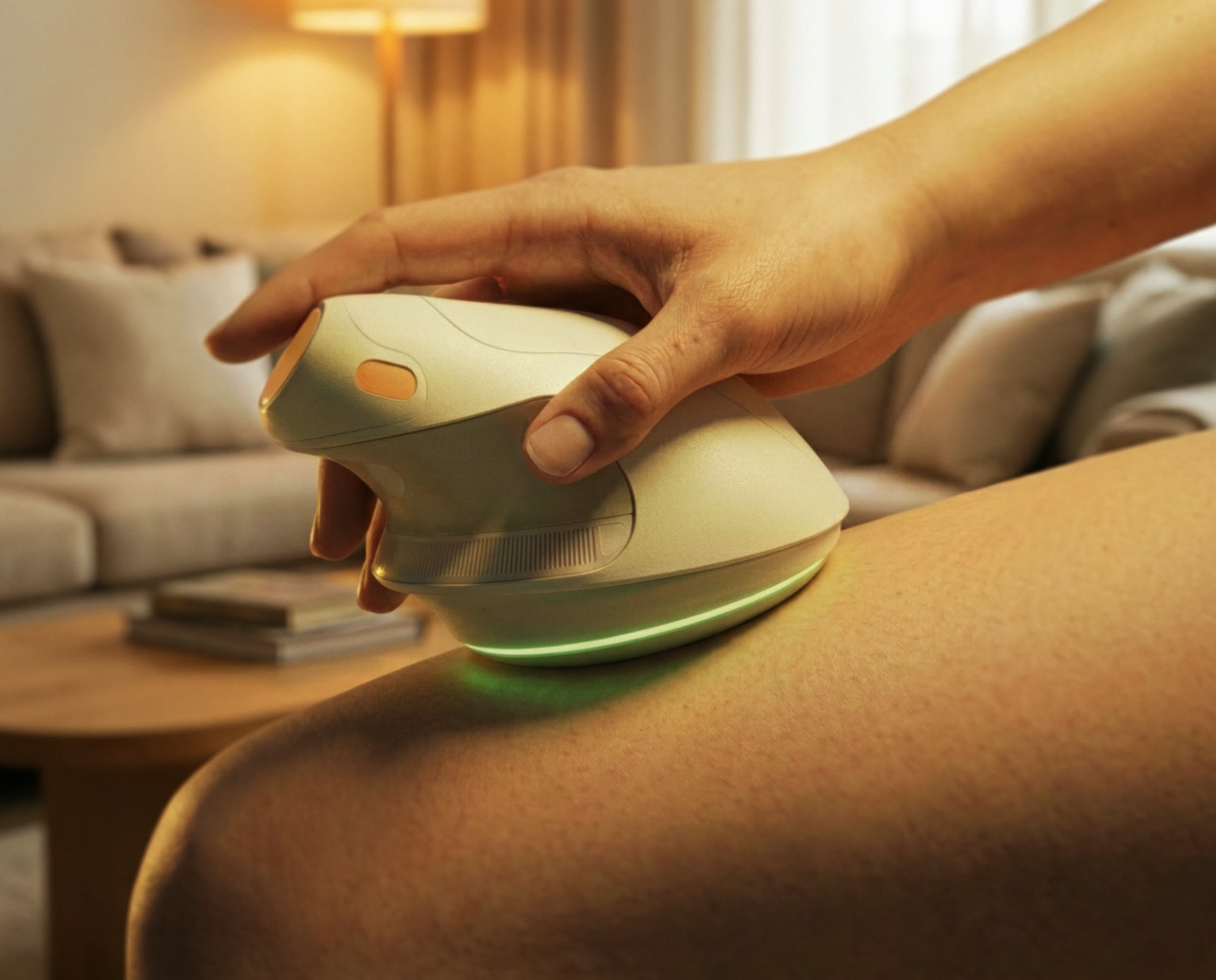
Two final renders. In the hand, the form rests naturally in the palm, and the only thing to align is the contact ring. Against the body, the silicone ring touches the skin first, while the shell stays off the surface.
Distraction.
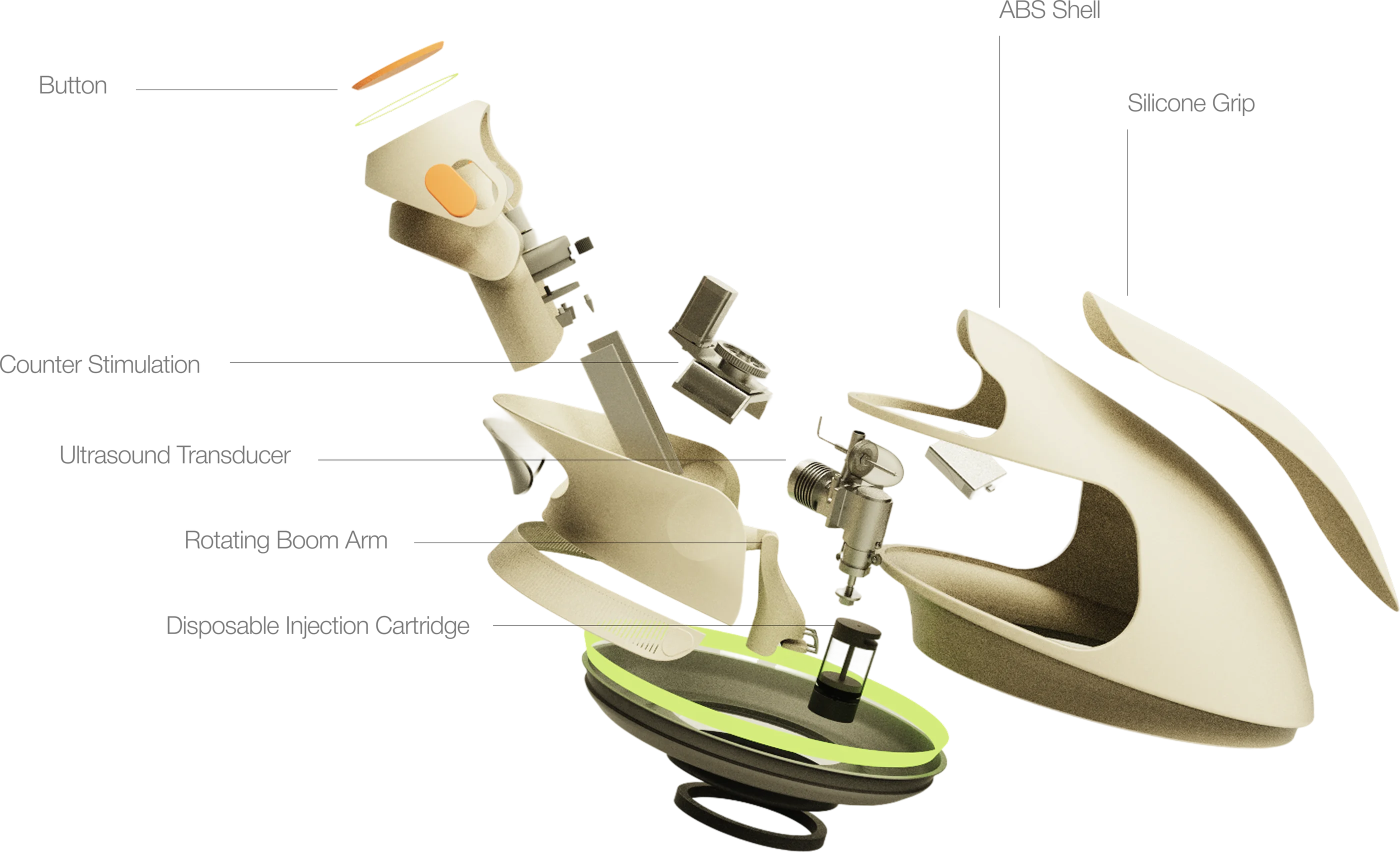
A silicone ring around the injection site provides a brief vibration just before the needle moves. This counterstimulation helps soften the sensation so the injection is less noticeable. It follows the same idea used in devices like Buzzy in pediatric care.
Precision.
A small ultrasound built into the contact ring reads the tissue at the site and sets the needle depth automatically based on the cartridge. The user does not need to pinch, measure, or guess. It removes a lot of the uncertainty and makes each injection more consistent.
Insides.
The internal layout is built around the rotating boom arm. Parts that touch the user like the contact ring, counter stimulation, and cartridge sit on the arm or along the base rim. Everything else like the motor, battery, and ultrasound system is contained inside.
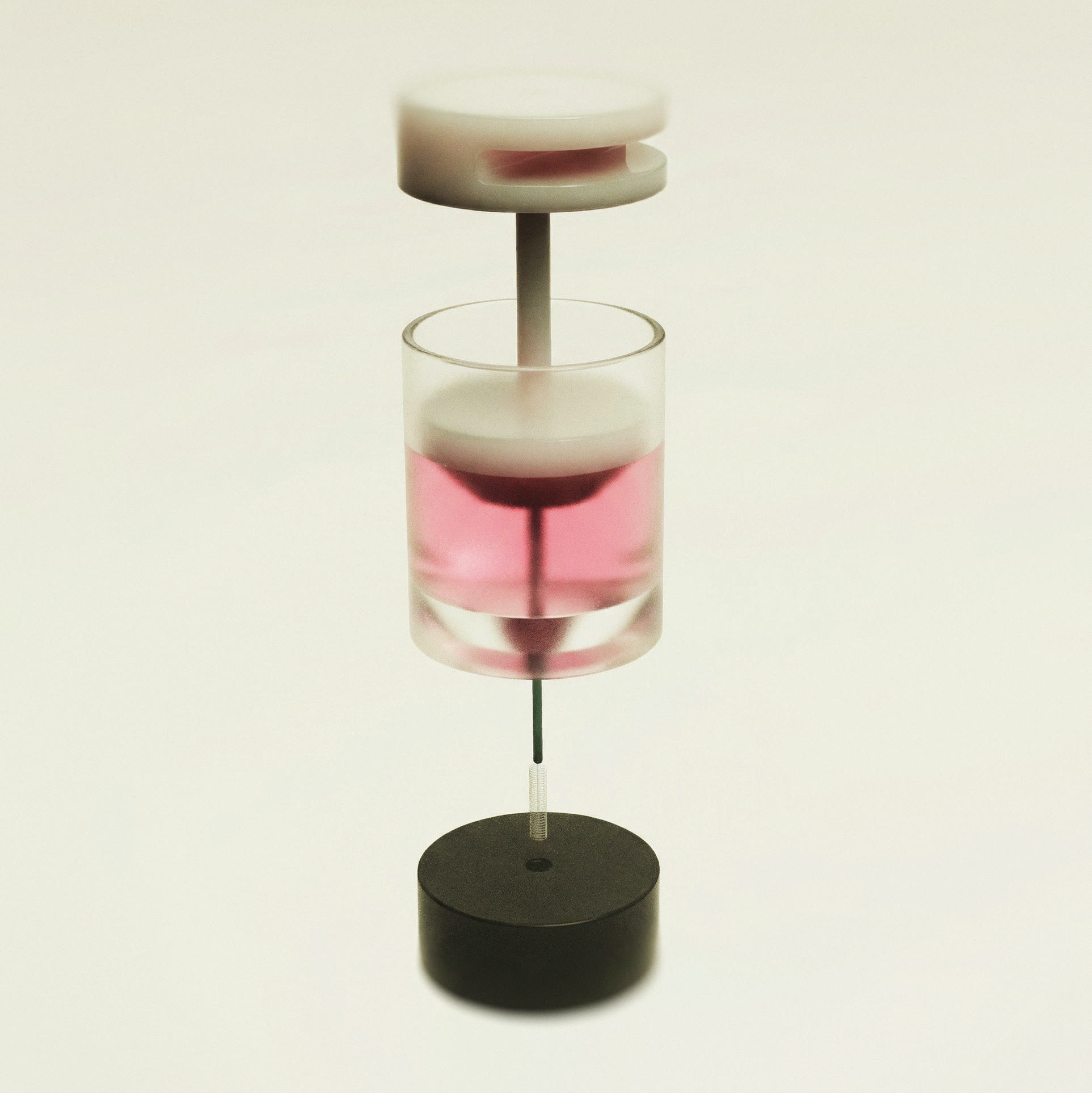
The injection cartridge.
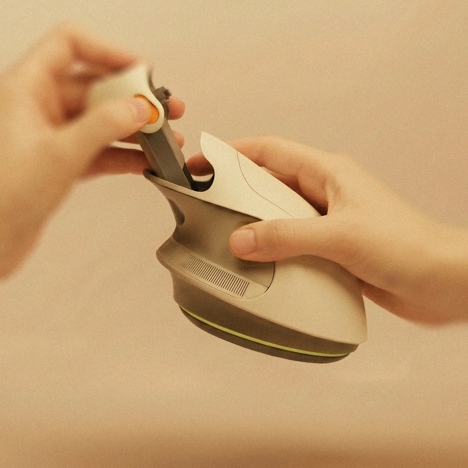
The cartridge is the only part the user handles directly, and it is disposable. It draws, meters, and injects within a sealed unit. There are no exposed sharps at any point between the vial and disposal.
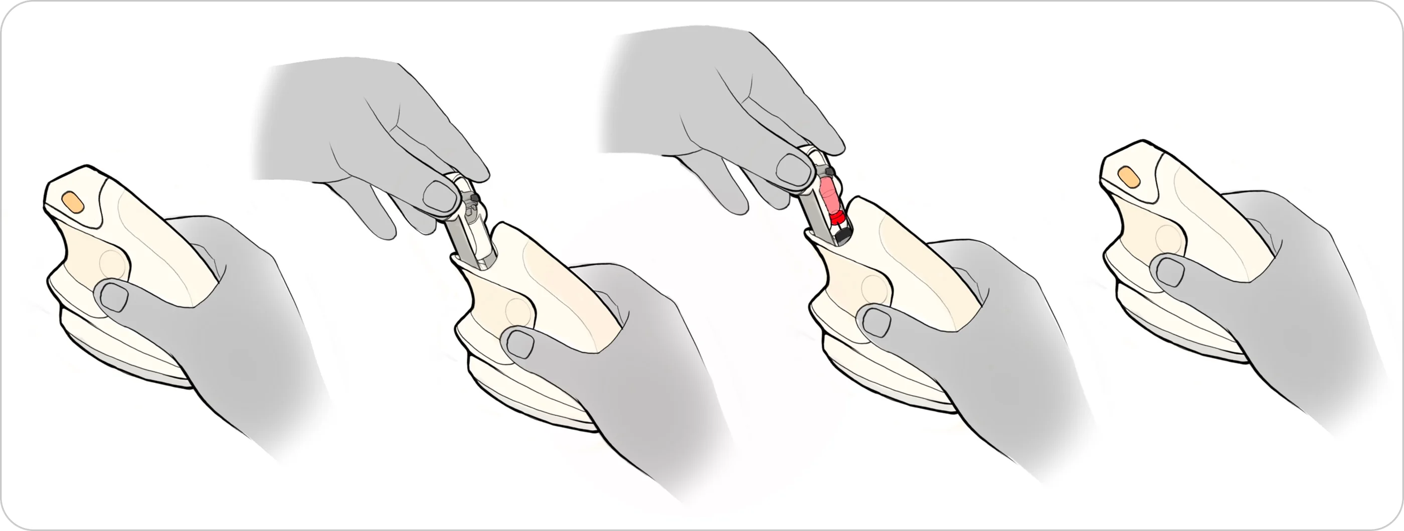
One button.
Loading uses one button. The status ring shows each step.
Lessons.
This project stayed grounded in the user from start to finish, with a clear focus on breaking the anxiety cycle around injections. I spoke with people who inject at home, built a persona from those conversations, and tested every form decision in hand before moving forward. Three rounds of 3D prints shaped the direction, refined the profile, and reduced the scale by 20%. The form, CMF, counterstimulation, and ultrasound all came directly from real feedback, all aimed at making each step feel easier and less stressful.