
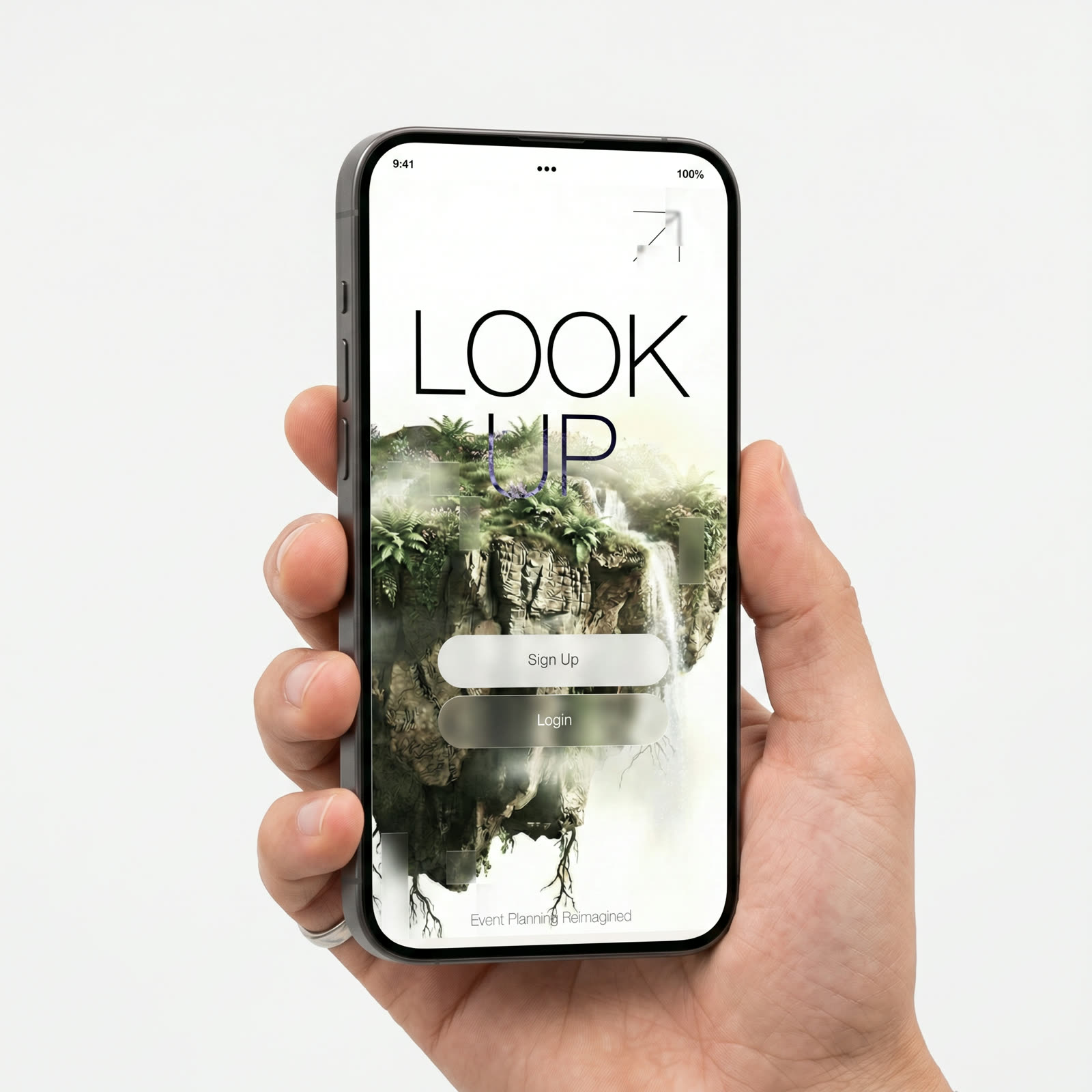
Look Up is a mobile app that uses geofencing to shape phone behavior inside an event. Hosts draw zones across the venue; each zone carries its own permissions. Attendees enter the room, and their device adapts in the background, quietly, without prompts, without negotiation. The product is the room, not the screen.
A conceptual product designed during a 24-hour sprint, research, concept, and system thinking. The demos you’ll see are UI prototypes and directional mockups, not a shipped application. The constraint wasn’t the story; it forced the story: one screen per surface, one rule per zone, no idea that didn’t earn its place by sundown.
Everyone is in the room. No one is.
At conferences, weddings, concerts, classrooms, anywhere a host has gathered people for a reason, phones quietly take over the experience. Conversations route through screens. A clip stands in for a thought. A photo replaces being there. The room is full, the attention is somewhere else.
Hosts notice. Speakers notice. The people in the room notice, and feel guilty without knowing what to do about it. The default response is a sign or a pre-show announcement, which works for about ninety seconds. The deeper issue isn’t willpower. It’s that the environment offers no resistance, so the device wins by default.
What people actually do at events.
The hackathon didn’t allow for a long study, so the research was concentrated and observational: three events I attended in the weeks before, plus quick interviews with two organizers and seven attendees. The pattern was consistent enough that the brief almost wrote itself.
Three behaviors stood out across every event: phones came out the moment a moment got awkward; people defaulted to filming whatever was in front of them rather than watching it; and conversations were increasingly mediated, the screen passed back and forth instead of words.
The takeaway wasn’t that phones are the problem. It was that context is the missing variable. People behave differently in a library than at a bar. The phone has no idea where it is, so it behaves the same way everywhere.
User journey map.
A trail through the attendee’s evening, one stop per moment the system has to hold its weight. The quiet stretches between markers are the point. A good behavioral product should feel uneventful from the inside.
Attention is a designable surface.
The reframe was simple: stop trying to change the person, change the room. Treat space as the controller, not the user. If the venue can declare what kind of attention it wants, the phone can follow that lead, without requiring the attendee to remember, decide, or negotiate.
That single move shifts the design problem from discipline to environment design. The attendee never has to be the bad guy in their own evening. The host never has to be the cop. The room does the work; the people just live in it.
The venue becomes the rule.
Look Up is two products in one. For hosts: a zone editor, draw shapes on a venue map, attach permissions to each. For attendees: an app that doubles as the event ticket, so adoption is mandatory by design and friction is zero by intent. Once inside, the attendee app listens for zone boundaries and adapts the device automatically.
No buttons to tap. No modes to choose. The attendee’s only interaction is, occasionally, a single line of text on the lock screen explaining what changed and why. The product is invisible until it isn’t, and when it surfaces, it surfaces with reason.
Information architecture.
Three surfaces, one system. The attendee app is deliberately shallow; the host dashboard carries the complexity; the platform quietly does the work between them.
- Ticket
- Now In (zone state)
- Lock-screen note
- Connections
- Profile
- Events
- Venue Editor (zones)
- Permission Rules
- Attendees
- Analytics
- Geofence Engine
- Bluetooth Beacons
- Permission API
- Event Sync
- Ticket Service
Drawing the flow before touching pixels.
Four low-fi screens to test the arc: arriving at the venue, crossing into a restricted zone, the state the phone holds while inside it, and the hand-off at the end. Grey boxes stood in for anything that could distract from flow.
Five features that hold the system together.
Each feature was chosen because it removed a failure mode from the research. None of them are flashy on their own; together they form a single coherent behavior, a venue that knows what kind of room it wants to be.
The venue carries its own rules.
Hosts draw zones on a venue map and attach permissions to each one. The zone definitions ship to every attendee’s device when the event opens.
What the system actually feels like from the inside.
Features on paper are easy to list. Easier to show two slices of the product in motion, one from the host’s side of the room, one from the attendee’s.
Drawing zones on the actual room.
The host stands inside the venue and sketches zone boundaries in-camera. What looks like a graphics flourish is the authoring tool, the room becomes the canvas, and the rules stay tied to the physical space they govern.
Plays when visible · pauses when it isn’tSave the person, revisit after the event.
Two taps to mark a connection in the moment, no swapping numbers, no breaking eye contact with a keyboard. The follow-up happens later, deliberately, when the conversation can actually continue.
Plays when visible · pauses when it isn’tTwo moments, one system. The next section walks the full path the attendee takes from ticket purchase to exit.
Ticket to presence in seven steps.
The attendee flow is intentionally thin. Most of it isn’t even visible, the moments the attendee experiences are the ticket, the entry, and the occasional one-line note on the lock screen. Everything else happens behind the curtain.
Attendee buys a ticket. Look Up is the delivery mechanism, installation happens here, before the event exists in their head.
The whole loop, from ticket purchase to first zone adapt, runs without the attendee tapping more than once.
Four trade-offs the product is built around.
Each one is a place where the easy answer pulled in one direction and the right answer pulled in another. Tap one to see the call I made and the reason it had to go that way.
What 24 hours taught me.
The constraint was the gift. Twenty-four hours doesn’t allow for a second draft, which means the first draft has to be the right argument, not the right pixel. The work stayed at the level of concept and interaction design: the surfaces that needed to exist, the rules they should follow, and the feeling the system was trying to create.
The bigger lesson was about behavioral design. It’s tempting to treat behavior as an outcome of UI: better screens, better copy, better nudges. The actual leverage is one layer up, in the system around the screen. Move the rule into the environment and the screen barely needs to do anything. The attendee app in Look Up does almost nothing on purpose; that’s the design.
What the concept would ask for next: a richer host editor with templated venue patterns (conference, wedding, classroom, club); an analytics surface for hosts to see where attention pooled and dispersed; and a calmer treatment of the override flow. The product reads as a direction, not a destination, and the direction is what the case study is really about.